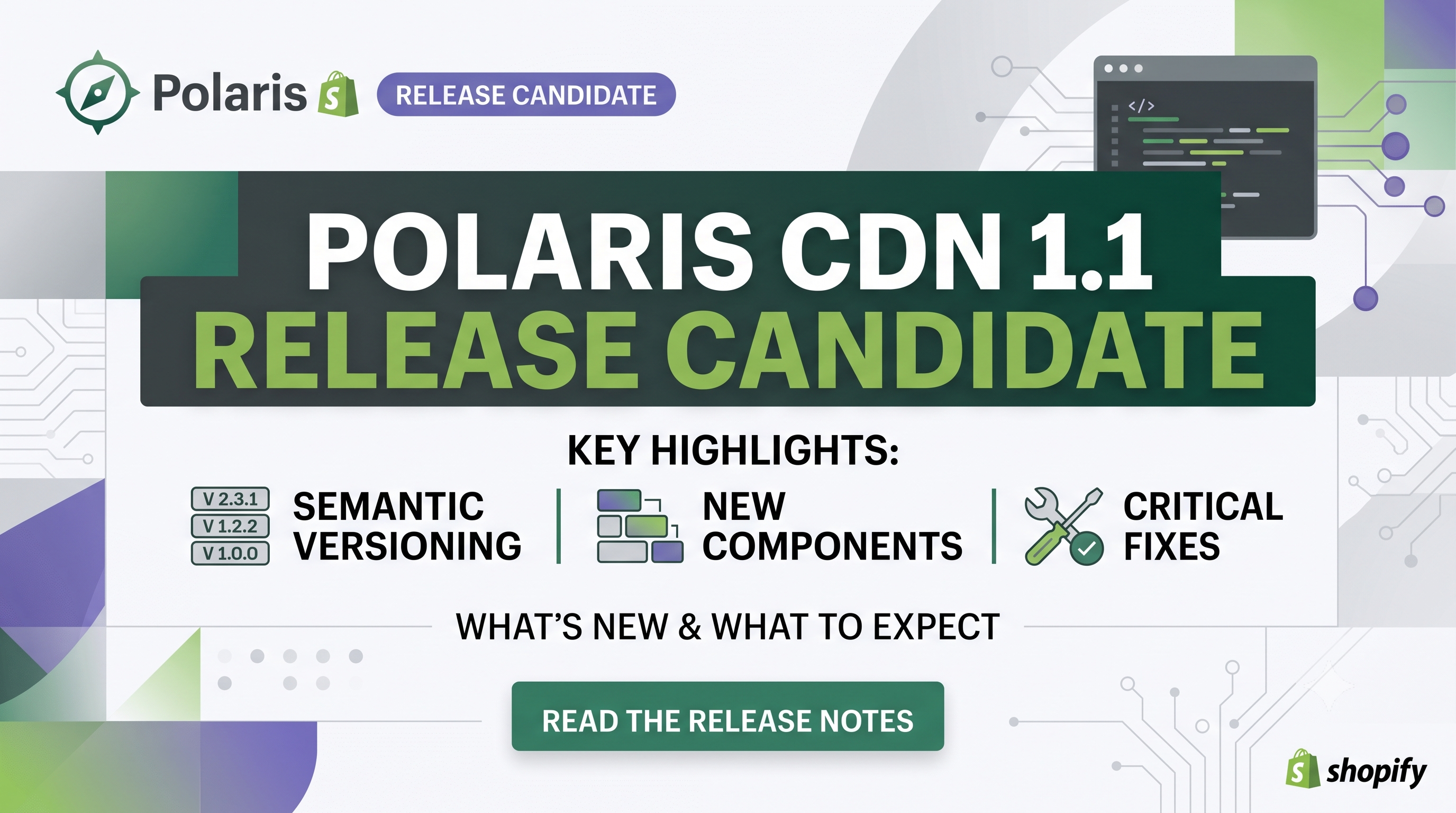
Shopify’s design system just got a major upgrade. The Polaris CDN 1.1 release candidate (RC) moves the library to semantic versioning, adds two brand‑new components, expands component properties, and resolves a long list of bugs that have been nagging developers for months. Whether you build custom apps, theme extensions, or pure‑HTML storefronts, this update changes the way you load and interact with Polaris components. In this post we break down every important change, explain who is affected, and give you a clear action plan so you can adopt the RC with confidence.
What’s New in Polaris CDN 1.1 RC
The biggest headline is the shift to semantic versioning. Previously the CDN delivered a monolithic bundle that changed behind the scenes. Starting with 1.1 RC, the URL you import now encodes the major version, letting you lock to a specific release and upgrade predictably. To test the candidate, simply replace your existing script tag with the one below:
<script src="https://cdn.shopify.com/shopifycloud/polaris-1.1-rc.js"></script>
New Components You Can Leverage
EmptyState – A ready‑made placeholder for empty tables, lists, or full pages. When placed inside a <TableBody> it spans the full width beneath the table headers, automatically handling vertical centering and responsive spacing.
Number – An inline numeric element that forces tabular figures, ensuring columns of numbers line up perfectly regardless of locale. Ideal for dashboards, order summaries, and any data‑heavy view where alignment matters.
New Props That Give You More Control
fontSize (Heading, Paragraph, Text) – Directly set the text size without nesting a <TextStyle> component. Accepts the same token values used throughout Polaris (small, medium, large, etc.).visibleMonths (DatePicker) – Choose whether the picker shows one month, two months, or lets Polaris decide (auto). This reduces layout jumps on responsive pages.supplementalStart (Page) – Insert content before the main page body (e.g., a banner or contextual help) while keeping the default header/footer intact.Bug Fixes That Matter for Production
The RC ships with a laundry list of stability improvements:
onShow, onHide, etc., properties.change events when React‑controlled components re‑set the same value, expands to full width by default, and improves screen‑reader announcements.max.autocomplete="off" now signal password managers to skip them, improving security.These fixes dramatically reduce edge‑case failures in production environments, especially for merchants with heavy custom UI logic.
Deprecations & Migration Guidance
The only deprecated prop is fontVariantNumeric on Text and Paragraph. It still works for backward compatibility, but Shopify recommends switching to the new Number component for any numeric formatting needs. Migrating is straightforward: replace <Text fontVariantNumeric>{value}</Text> with <Number>{value}</Number> and you’ll get automatic tabular figures plus future‑proof styling.
Who Is Affected and What Actions to Take
Developers – If you load Polaris from the CDN, update the script URL to the RC version. Test each UI component that your app or theme uses, paying special attention to the newly versioned events (Overlay) and the new props (fontSize, visibleMonths, supplementalStart). Adjust any custom CSS that relied on the old overlay bubbling behavior. Finally, replace any remaining fontVariantNumeric usage with the Number component.
Merchants – The changes are invisible to most store owners because they occur at the component level. However, if you use a custom theme or a third‑party app that pulls Polaris directly from the CDN, you may see subtle UI shifts (e.g., heading sizes or empty‑state placeholders). Review your storefront after the upgrade and let the app developer know if you spot regressions.
Practical Code Examples
html
<!-- Load the RC bundle -->
<script src="https://cdn.shopify.com/shopifycloud/polaris-1.1-rc.js"></script>
jsx
import {EmptyState, Number, Heading, DatePicker, Page} from '@shopify/polaris';
function Dashboard(){
return (
<Page supplementalStart={<Banner title="Beta" status="info" />}>
<Heading fontSize="large">Sales Overview</Heading>
<EmptyState
heading="No orders yet"
action={{content: 'Create first order', url: '/admin/orders/new'}}
>
<p>When orders start coming in they’ll appear here.</p>
</EmptyState>
<Number value={12345} />
<DatePicker visibleMonths={2} onChange={(value) => console.log(value)} />
</Page>
);
}
Conclusion & Next Steps
Polaris CDN 1.1 RC is more than a minor patch—it introduces a predictable versioning model, two powerful new UI primitives, and dozens of bug fixes that make production deployments smoother. For developers, the safest path is to swap in the RC script on a staging environment, run your UI test suite, and address any deprecations before the GA release. Merchants should coordinate with their theme or app developers to ensure the latest bundle is served, guaranteeing a polished and consistent shopping experience.
Ready to upgrade? Update the script tag today, explore the new components, and let us know how the changes improve your store’s performance. Happy building!