
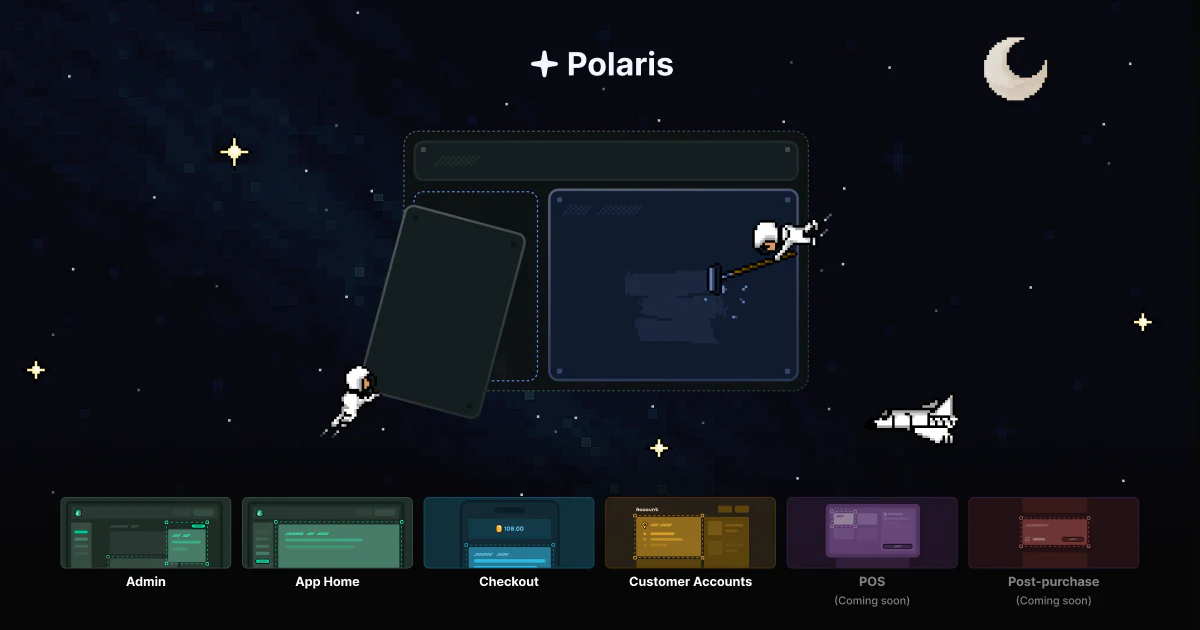
Today, we're thrilled to introduce the new Polaris—a unified UI toolkit that works seamlessly across all Shopify surfaces including Admin, Checkout, and Customer Accounts. Built on Web Components, the new Polaris is significantly smaller and faster than its predecessor, working intuitively with any framework—or none at all. Developers can now create consistent experiences across all Shopify touchpoints using familiar, HTML-like components with unified APIs and properties. This next evolution of Polaris is delivered directly from Shopify's CDN, ensuring your components are always up-to-date. The new Polaris is available now, empowering you to build more cohesive, performant app experiences wherever your users interact with Shopify.
Expanding reach with web components
As we previously mentioned, Shopify’s platform is the web platform. We aim to make the developer experience familiar to as many web developers as possible. By offering custom web components, developers can code their apps and UI extensions in a way that feels like writing HTML, without needing to learn new paradigms or frameworks.
Web components allow developers to encapsulate and package functionality into custom HTML tags, creating reusable and standalone components that maintain compatibility across different environments. We began introducing custom web components with the App Bridge APIs such as the Navigation Menu and Title Bar. Now we are continuing that familiar syntax across all essential UI components.
<s-section heading="Subscription Toast">
    <s-text-field name="toast" placeholder="e.g. We'll be in touch!"></s-text-field>
    <s-paragraph>A short toast message to show when someone subscribes</s-paragraph>
</s-section>
Easier to bring app experiences to multiple Shopify surfaces with unified components
Shopify developers will now find common components and props across surfaces. This means that Admin UI extensions, Checkout UI extensions, Customer Account UI extensions as well as the components inside App Bridge will have familiar APIs, props, and values but rely on a different design system when needed. This eliminates having to learn the bespoke differences across surfaces and just lets you build the Shopify way
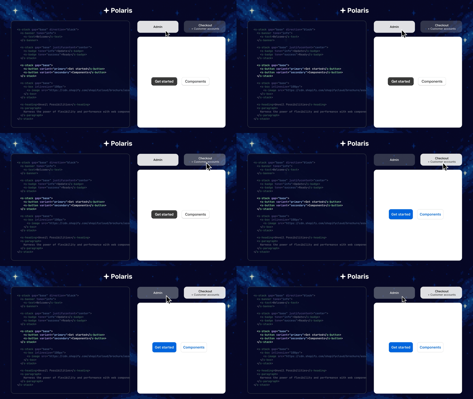
Putting components into App Bridge means that we have eliminated the need to have 2 separate libraries to build the frontend of your App Home experience. Using the components inside the <script> tag means you will always be on the latest.
Performance and evergreen design
We’ve eliminated React’s runtime overhead in UI extensions through our web components approach, reducing bundle sizes and improving performance while maintaining full functionality. For App Home, components load directly from Shopify’s CDN ensuring your app automatically inherits the most up-to-date Shopify design system.
How to get started Polaris is currently available as a Release Candidate (RC). To implement these new components in your project:
These new Polaris components are designed with modern development workflows in mind, including those that incorporate Large Language Models (LLMs). You can now access the latest API documentation through the Shopify.dev MCP Server. This makes it simple for you to integrate Polaris’s newest features directly into your LLM-assisted development workflows using tools like Cursor, GitHub Copilot, or Claude Code. Now, you can build and update your Shopify apps faster and more efficiently than ever before.