
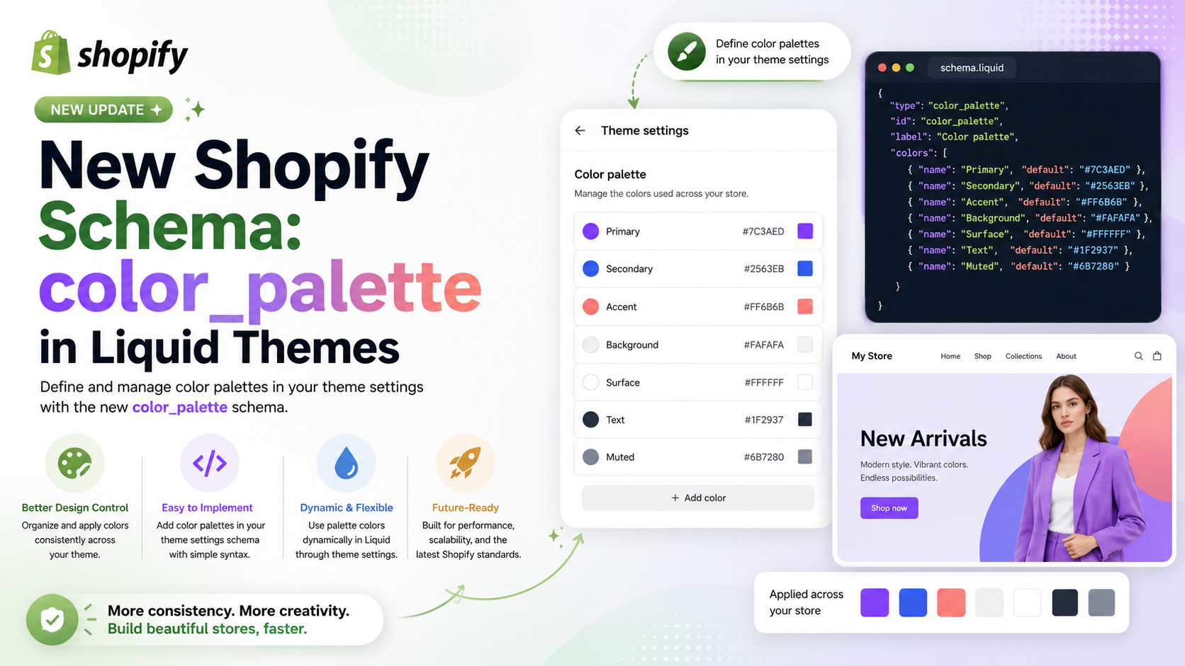
A setting of type color_palette defines a set of named colors available across your theme's color and color_background settings. Merchants see these colors in a grid in the theme editor and can pick from them when adjusting any color setting.
You can add only one color_palette per theme, and it must be in settings_schema.json. The default object defines the theme's starting palette. Any changes a merchant makes in the theme editor are stored in settings_data.json and take precedence over the defaults.
Unlike most input settings, color_palette supports only the id standard attribute, which is required. The label, info, and visible_if attributes aren't supported. It has the following additional attribute:
| Attribute | Description | Required |
|---|---|---|
| default | An object of key-value pairs defining the palette colors. Keys must start with a letter and can contain letters, digits, and underscores. Values must be valid hex colors without an alpha channel (for example, #FFF or #FF4416). Eight-digit hex values with alpha aren't supported. At least two entries are required. | Yes |
A palette supports between 2 and 20 colors. Colors are returned in the order they appear in the JSON.
For example, the following setting generates the following output:
{
  "type": "color_palette",
  "id": "colors",
  "default": {
    "primary": "#121212",
    "secondary": "#FFFFFF",
    "accent": "#FF4416"
  }
}
When accessing the value of a color_palette type setting, you access individual palette colors through settings.<id>, where <id> matches the id you defined in the schema. Each color is returned as a color object with full access to color properties and filters.
{{ settings.colors.primary }}Iterating over the palette yields each color as a color object in JSON key order. Keys aren't available during iteration, only the color values:
{% for color in settings.colors %}
  {{ color }}
{% endfor %}
Cross-setting references
You can use a palette color as the default value of a color or color_background setting. The value must be a Liquid output tag that references a palette key, for example {{ settings.colors.primary }}. Only color_palette access paths are supported as dynamic defaults. See the color and color_background sections for examples.
Theme updates
When a theme update adds new keys to the palette default, those keys appear automatically in the merchant's palette. Merchant-customized values are preserved and take precedence over new defaults.
Deleting palette colors
When a merchant deletes a palette color in the theme editor, Shopify asks them to choose a replacement. The deleted color's value is stored as a reference to the replacement, for example {{ settings.colors.accent }}. This keeps all existing references intact without updating every template that uses the deleted color.